Why Empty States Shouldn’t Be Empty
Published on 28 Apr 2022 inEmpty state screens are mostly ignored until the UI is almost done, then you suddenly realize some screens might be empty at certain times. The easiest solution is to slap on an error message and call it a day. Besides, why spend so much time on a page that only 2% of users see and when they do see them, it’s for a few seconds? It might be more economical to focus your time and effort on other screens that everyone would see. Right?
Well actually, that 2% you chose to ignore matters more than you realize. They could be new users exploring your product and deciding if it’s worth their time or not, and if they don’t know what to do next they may become frustrated. They might not understand the features of your product or how to use it and decide to uninstall the app.
As designers, we should take every opportunity to improve the user experience and add more value to the business.

Source: Spotify
What is an empty state in UX design?
Empty states are screens that have nothing to display or have not yet filled with information. For example, a new Dropbox screen where no files have been created yet, searching for something on Gmail and getting no results back or starting a new Facebook account and having no activities or friends.
A good empty state informs users what is happening and why it is happening, but the best empty state informs users what to do next.
There are 4 main types of empty states that users frequently encounter:
- First use – occurs to first time users when there is nothing to show
- User cleared – when users complete an action, such as clearing a list or inbox and the result is an empty screen
- Errors – when something unexpected occurs or when there are issues
- No results/data – when there is nothing to show, such as returning no search results.
Benefits of empty states
The advantages of a well-designed empty state shouldn’t be overlooked. Not only do they contribute to improving user experience, but they also serve as windows of opportunity to keep customers satisfied and engaged.
- User onboarding – opportunity to build trust and showcase values that the business can offer to customers
- Brand building – raise awareness and promote the company to create brand equity
- Personalization – creates a personal human touch by being playful, fun or serious depending on what the business wants to convey
Empty state best practices
Here are some tips that you should keep in mind when designing effective empty states.
Be informative
When users encounter an empty state 2 things needs to be conveyed:
- Purpose of the screen
- Why am I seeing this empty state?
The example empty state is effective at communicating with users. If you read carefully, the screen conveys the purpose of the screen and the purpose of saving a message as a draft.

Source: Material.io
Handle failure states
If there’s an error, you must inform users what’s wrong and suggest how to resolve the error. Here’s what you can do with error empty states:
- Show non-technical copy of the error text (most people don’t know what error 404 means)
- Suggest steps to resolve the issue with the least amount of text
- Don’t use technical terms
- Allow users to reload page

Source: Google Cast
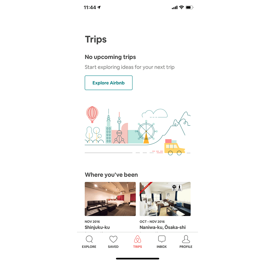
Provide a call to action
Empty states provide designers with an excellent opportunity to encourage users to interact with your product. You can educate them on how the features of the product and how to use them, instead of leaving users feeling lost in your UI. The situation can be easily fixed by adding a call to action button that informs users of the next step.


Add personality
There is a thin line between creating a brand personality and coming off as unfunny and desperate. Your empty state is one of those places where you can add personality to your product. This doesn’t mean you should always resort to humor, a joke could be fresh today but boring tomorrow. Adding surprise and delight can transform the user experience even in empty state screens that users rarely encounter.
Source: Google Chrome
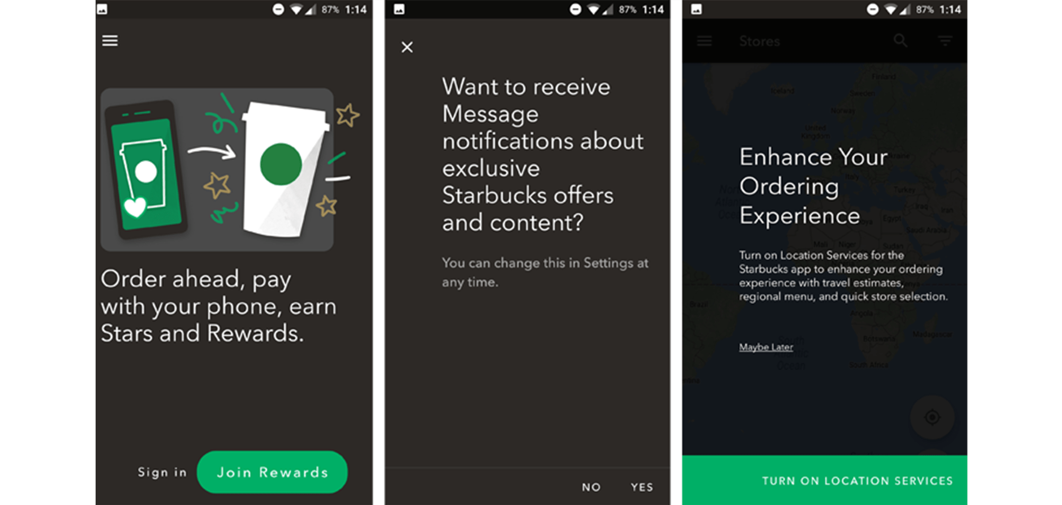
Starter Content
You can use empty states to demonstrate how to use your product and important features. Using empty states for the onboarding process is effective as it familiarizes users with the product and also makes your product useful to users.

Source: Starbucks app
Empty states don’t have to be empty as it’s ripe with potential, they could be effectively utilized to start a conversation with users. A conversation that may lead to a long-lasting relationship between your product and users. By applying the tips outlined above, you can create an empty state that provides a clear call to action to encourage users to engage with your product.
Taylor Swift once said, “But I’ve got a blank space baby and I’ll write your name”. If a singer knows you can’t leave a blank space blank, I’m sure as designers we can come up with something more creative.
Visit our services page to learn more about UX UI design at Morphosis today.
Subscribe to our newsletter.
Here are some related articles
Product Design
Let us will help you open new business opportunities by giving you a new perspective on your digital product you may not have considered before.