
How to Use Conversion-Centered Design to Build More Effective Landing Pages
Published on 08 Jun 2023 inWebsites have come a long way since the first ones were created in the late ‘80s in a computer lab somewhere in Switzerland.
Those simple text-only HTML pages have evolved into modern websites with smooth animations, beautiful dark themes, ample white space, and bold typography. And now they are viewed by billions of users a day, making the internet a global market outside of the physical world.
The evolution of web design has also paved the way for designers to fine-tune user experiences and create better navigation to win over customers. One of the most effective ways to do this is through conversion-centered design (CCD), which specifically targets and serves the business goals of websites.
What is conversion-centered design?
In a design context, conversion is when a user takes the action that you set up for them on your website to help you achieve your business goal.
CCD for its part uses a set of established design disciplines and psychological triggers to induce users to take that action, thus helping websites convert visitors into customers. The intended action could be as simple as clicking to another page or as complex as making a purchase or signing up for service.
CCD also allows for you to measure the purpose, impact, and success of your website or campaign. And, if not, your site wasn’t designed correctly.
As with all things design, CCD is somewhere between an art (visual, UX, and content design) and a science (measuring and analyzing results).
What are the seven principles of conversion-centered design?
Now that we are familiar with the term conversion-centered design, here are the seven principles of CCD to consider when creating a website or landing page.
Encapsulation
Say you want to direct visitors’ attention to important information or a call to action (CTA) so they don’t wander elsewhere on your website. Like wrapping a present to attract attention to a birthday gift, you might make those sections stand out by wrapping them up and separating them from the rest of the page. This will lure your visitors’ attention toward these high-value areas and make it clear to them that the content is important.
What do you wrap in CCD?
The content that triggers the action that you desire.
If it’s a click that’s required, make the button big and interesting. If it’s a signup, call attention to it.

Contrast and color
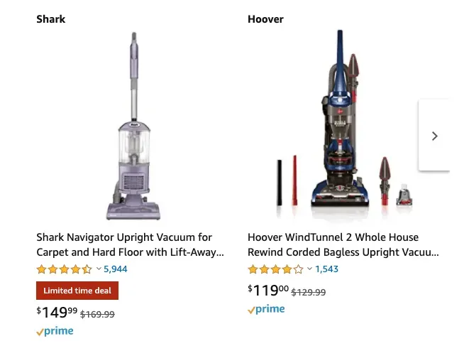
Perhaps the most important principle in designing a CTA, the use of color and contrast can make or break quick conversions.
You wouldn’t want to miss out on conversions by blending your CTA with the rest of the content. So, to make a CTA stand out as the most important element of a page, use colors with high contrast levels. For example, a black button on a white background or green button on a red background will make it pop.
An estimated 5 percent of men and 1 percent of women are color blind, and most of them find it hard to distinguish a CTA made with colors that have low levels of contrast. Although color-blind people don’t make up a large percent of the total users, they are still a significant population that cannot be ignored.
Countless color combinations are available that have good levels of contrast and yet gel-like macaroni and cheese. Find the right combination of color and contrast for your CTA and you’ll more likely have anyone and everyone take action.

Direction cues
Use indicators to guide your visitors to the goal you want them to reach. An arrow or a pathway can guide users to your intended focal point, clearly saying that this is where they need to look and that they can ignore the rest for a moment. And, if you’re using a photo, use the line of sight to point out the call to action.

Whitespace
Whitespace in design doesn’t necessarily mean a space filled with white. It just means keeping as much blank space as possible on the page and not cramming things up. This helps visitors stay visually calm and easily navigate to the area of importance.

Urgency and scarcity
Consumers can often be driven to take action when they are faced with limited time and/or supply.
In e-commerce websites, marking products as running out of stock (only 3 left!) or running a limited-time promotion are good examples of creating a state of urgency or scarcity. You are indirectly asking them to take the action ASAP or they will miss out on a great deal.
Try before you buy
Allow your users to have a sip or taste of your product without actually charging them.
For example, a premium cheese shop might put out a selection of cheeses for customers to sample before they actually buy any. This allows customers to take a sliver of each and every cheese, and then buy their favorite. That way, the cheese is worth every penny and the customer has no regrets.
Make your products openly available for review prior to asking your customers to pay. As a result, you will appear credible and win trust that could potentially boost conversions.
Social proof
Public opinion is key to the success of any business. The more people start saying good things about your product, the better the chance it will succeed. Displaying social proof in the form of feedback about your customers’ experiences with your products or services can instantly build trust in new visitors.
Testimonials are one of the most common forms of social proof on websites. Other useful forms of social proof include product reviews and ratings, which also make it easier to determine the quality of products.

Oli Gardner, the co-founder of Unbounce, introduced these principles and they are now a widely accepted benchmark for tackling real business problems on the web.
Gardner also emphasizes a few other aspects that he believes are important to achieving conversions, including “message match.” If done correctly, it can make navigation smooth and win your trust, while doing it wrong can make you lose credibility.
What is a message match?
You’ve doubtless come across random ads while browsing the internet. Some might have been based on recent searches and conversations — I’ve heard spooky stories of hackers spying on our bedroom conversations, but that’s another conversation — while others are totally unrelated to our lives.
Either way, you know this situation — an ad catches your attention and for some reason, you decide to click on it only to end up on an odd website with content that’s totally unrelated to the ad you clicked on. More than being curious about the mismatch of messages, you will probably be annoyed by having been misguided by the website. This is a message match fail.
How do you fix message match failure?
Ninety percent of ads fail to match the message of the landing page they lead to, even though doing this right doesn’t require ninja-level skills. All it takes is a little attention to detail.
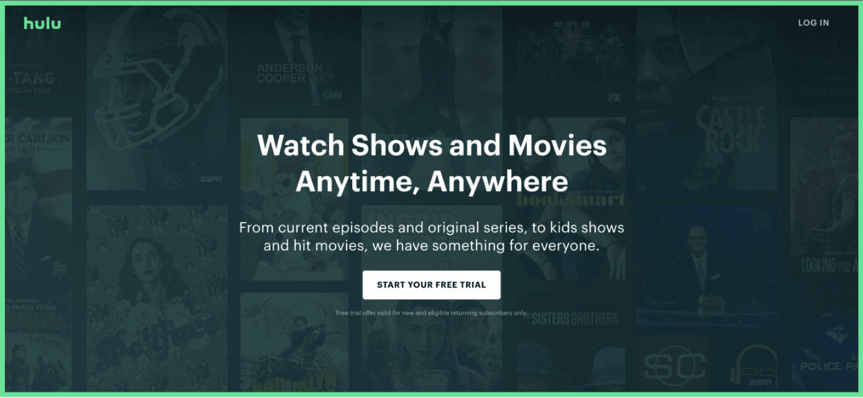
So what is a message match? Using the same headline, description, value proposition, and image on the landing page as you used in your ad. Done properly, users who read and click an ad see the same message conveyed on the landing page. That’s a message match.

The landing page for the ad conveys the same message as the ad’s title. It’s a message match!
Final Thoughts
Almost every person or company with a website today wants a design strategy that is optimized to convert and achieve their goals. CDD practices are modern design tools that can help you do this. So the next time you are designing a new landing page, have your checklist ready with these principles and go through them to see if they align with your design.
For more help creating landing pages informed by conversion-centered design, reach out to our team at Morphosis. We’re happy to help you with this and all of your design and digital marketing needs.
Subscribe to our newsletter.
Here are some related articles


Product Design
Let us will help you open new business opportunities by giving you a new perspective on your digital product you may not have considered before.